app.novaaiops.com/service-health-matrix
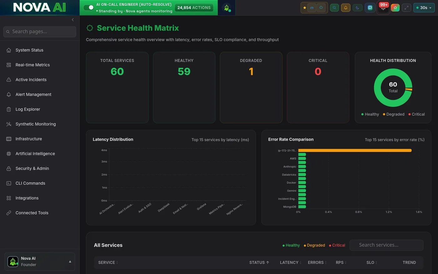
The Service Health Matrix gives your SRE team a single-pane view across all 96+ services, live SLO compliance, P50/P95/P99 latency, error rates, and expandable dependency rows. No more tab-hopping between dashboards when you're trying to find the blast radius of a degradation.
The top of every Service Health Matrix view opens with a live donut chart showing the ratio of healthy, degraded, and critical services across your entire fleet. Below it, a KPI strip surfaces the key numbers that matter right now, total SLO breaches, services burning error budget, and open incidents, so on-call engineers have full context in under three seconds.
Averages lie. The Service Health Matrix tracks P50, P95, and P99 latency per service and compares them against your defined SLA thresholds in real-time. When P99 starts creeping toward your SLA ceiling, even before it breaches, Nova fires a warning alert so your team can investigate before customers feel the slowness.
When a database connection pool exhausts, error rates cascade across every service that depends on it, but they don't all spike at the same time or at the same rate. The Error Rate Comparison view shows all services side-by-side on the same timeline, making cascading failures visually obvious within seconds of them starting.
The SLO Compliance Table is sortable, searchable, and expandable. Sort by current burn rate to find the services most at risk of SLO violation this week. Expand any row to see dependency chains, historical compliance trends, and exactly how much error budget remains. Everything your team needs to prioritize reliability work, in one table.
Stop discovering SLO violations from customers. Get the full Service Health Matrix across all 96+ services in minutes.